

Most pages fail before the writing starts. The owner lists everything the business does, the designer fits it into boxes, and nobody decides what the visitor came to do. Copywriting for web pages works differently. You pick one task for the page, put the answer where a scanner will find it, and check whether a stranger can act on it. Headlines, browser titles, link text, form labels, and error messages are one system, not separate jobs. When those pieces disagree, even good prose won't save the page.
A Four-Stage Workflow for Writing Web Copy
Weak pages usually skip the first stage and go straight to drafting. I'd reverse that. Do the thinking first, write second, and you'll have less to rewrite later.
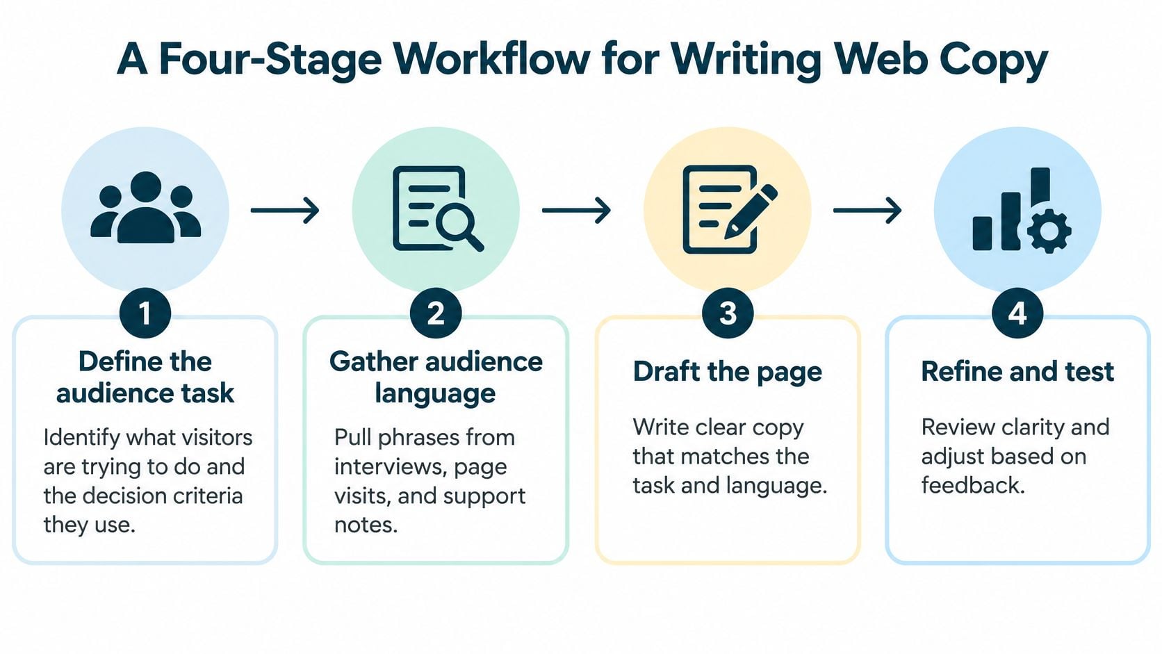
The four stages in order
- Define the audience task. Talk to customers, look at which pages people already land on in your analytics, and read the exact questions visitors type into search. You're after two things, what they're trying to do and what they check before deciding.
- Draft around one outcome. Give the page one explicit user outcome, such as booking a visit, requesting a quote, or giving once. A page that does one job well usually beats a page that lists every service and leaves the reader to sort it out.
- Break up dense prose. Turn long paragraphs into descriptive headings, short paragraphs, and bullets. Put the conclusion at the top of each section so a scanner gets the point without reading to the end.
- Validate before you add more. Test whether people can complete the task, then watch whether they do. If they can't, fix the structure first.
That order matters more than polish. The Nielsen Norman Group controlled comparison found that concise copy improved measured usability by 58%, scannable copy by 47%, and objective copy by 27%, with all three combined producing a 124% improvement.
What a service page needs
For a service page, the structure is simple. Name the problem, show evidence, list deliverables, explain the process, state the constraints, and end with one clearly labeled next step. Skip generic claims that any competitor could paste onto their own site. They don't help a reader decide, and they don't help you either.
Poor information hierarchy adds search and decision effort even when the underlying service is strong.
Run this workflow separately for each important page rather than once across the whole site. Start this week with the page that brings in the most inquiries and put it through stage one.
Finding the Words Your Audience Already Uses
Your customers have already written most of your page for you. You just have to collect what they've said.
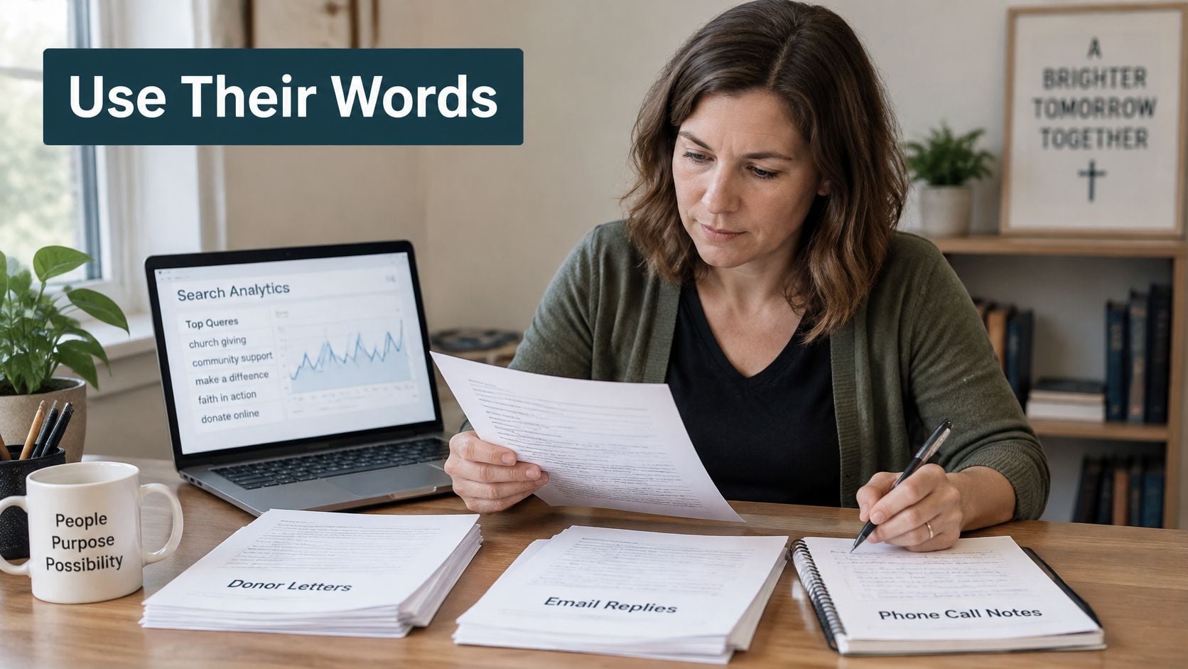
Look in reviews, email replies, phone call notes, volunteer questions, donor letters, and the search queries in your analytics. If church members keep asking where to park for the 9 a.m. service, answer that question in the first screen of the visit page, in the same words they used. Don't translate it into marketing language. Their phrasing is the phrasing a new visitor will search for and recognize. If you want to organize what you learn, our notes on building buyer personas from real customer input show how to turn scattered comments into a usable profile.
A value statement with three parts
Build the opening of the page from three parts. Name who the page is for, say what changes for them, and give a reason to believe you. Say a small plumbing company wants same-day leak repair work. Its statement might read, homeowners in its service area can get a leak fixed today by a licensed technician named on the page. That's plain, and it works because each part can be checked.
The short video below walks through gathering that kind of audience language before drafting.
Test every claim the same way
Ask one question of each claim. Could a stranger check it? If not, replace it with a specific detail, such as a response window, a service area, or what's included in the price. "Fast, friendly service" fails that test. "We answer the phone until 7 p.m. on weekdays" passes it. Keep one value proposition per page, not five competing for attention.
Strong work shows up in the details. Each website is crafted to help the client achieve its unique business goals, and that difference should be visible in the copy rather than hidden under template wording. Ace Elliott, Bruce & Eddy's copywriter, has over 15 years of experience helping websites get found through content, and that experience goes into matching the words on the page to the words customers use.
What Each Page Element Has to Do
People don't read web pages the way they read a letter. The Nielsen Norman Group 1997 study found that 79% of test users scanned each new web page they encountered, while only 16% read word by word, and later Nielsen Norman Group research found users had time to read at most 28% of the words during an average page view. Eye-tracking work also shows an F-shaped reading pattern, with attention concentrated near the top and left side of the page. So the top of your page has to carry the audience, the offer, the proof, and the next action.
That means every element has one job. If it isn't doing that job, rewrite it or cut it.
| Element | Job for the reader | Example for a church or nonprofit |
|---|---|---|
| Browser title | Name the page and its purpose before the click | Food Pantry Pickup Hours and Eligibility |
| Main headline | Say who the page is for and what they get | Weekly Food Pantry Pickup for Local Families |
| Opening paragraph | Confirm the reader is in the right place within two sentences | Pickup is open to any household that needs groceries this week, and you don't need an appointment. |
| Subheadings | Let scanners find their own question | When to Come, What to Bring, Who Can Help |
| Primary call to action | Name the next action in plain words | Reserve a pickup time |
| Form instructions and errors | Explain what to enter and how to fix a mistake | Enter your household size as a number, such as 4 |
Tone that helps instead of decorates
Write the way a helpful staff member answers a question at the front desk. Use contractions and short sentences. Answer the question, then stop. Abstract praise words don't tell a visitor whether she's in the right place, so swap them for hours, locations, names, and next steps.
Clear movement between pages matters as much as the copy on each page, since a visitor who can't find the next page won't read it. That's why our websites are built to be logical and easy to move through from page to page, with mobile devices and search engines in mind. Once the elements are in place, Keywordme's guide to landing page testing is a useful next read on checking whether a headline or call to action change helps before you roll it out everywhere.
Practical rule: If an element doesn't answer its one question, it isn't finished, no matter how nice it sounds.
Ordering the Sections of a Page
Order decides whether a scanner finds the answer or gives up. A church visit page makes the logic easy to see, and the same sequence adapts to most service and nonprofit pages. For layout references while you sketch it out, our collection of website layout examples shows how these blocks sit on real pages.
- Headline. Name the visit and the reader, such as First-Time Visitors to Sunday Worship.
- Opening paragraph. Give service times, the location, and whether children's programs run during the service.
- Primary action. Place "Plan your first visit" directly below, in plain words.
- Practical questions. Cover parking, arrival, and what to expect, with each question as a subheading worded the way people phrased it on the phone.
- Contact. Name a person and how to reach them, with a form that asks only for a name and an email.
- Trust context. Add a short description of the congregation and a photo of the building so visitors recognize it on arrival.
- Secondary links. Put ministries or giving last, labeled so they don't compete with the main action.
A nonprofit donation page follows the same logic, with a short impact summary placed above the amount choices. The tradeoff to watch is timing. Put the action high enough that a reader who's decided can find it fast, but not before the reader has the facts needed to decide. Treat this order as a starting point, then check it against your own analytics and scroll data before rebuilding anything.
Calls to Action and Microcopy That People Can Use
A call to action should name the outcome in plain words. The same rule covers links, form labels, and error messages, because visitors meet all of them at the moment they're deciding whether to act.
The WCAG 2.1 Success Criterion 2.4.4 requires that a link's purpose be understandable from the link text alone or from the link text plus its programmatically determined context. "Click here" fails that test for screen-reader users who move through a page by pulling up a list of links. The same guidance says headings and labels should describe their topic or purpose, and that labels or instructions must be provided when content requires user input. These are writing requirements, not just coding details.
| Vague text | Descriptive text | Why it works |
|---|---|---|
| Click here | Download the annual report (PDF) | Names the file and its format |
| Learn more | Compare nonprofit website plans | Names the destination |
| Submit | Request a site review | Names the outcome of the action |
| Read more | Read the March volunteer schedule | Makes sense in a list of links |
| Next | Book a discovery call | Tells the reader what happens next |
| Invalid entry | Enter a phone number with area code | Says how to fix the error |
Three rules for usable microcopy
- Keep one primary call to action per page. Two competing buttons make the reader choose, and many won't. Our overview of persuasive writing techniques covers how to support that one action without piling on pressure.
- Place the action where the reader has enough information. A button above the price, hours, or eligibility rules asks for commitment too early. Captiwate's landing page conversion guide makes a similar point about matching the ask to what the visitor knows so far.
- Write button text that works out of context. Read every button aloud without the page around it. If the meaning is unclear, rewrite it.
Accessibility failures often block the actions that bring in money or signups, such as a form that can't be completed by keyboard. Clear labels are a conversion issue, not a courtesy.
Writing for Search Without Stuffing Keywords
Start with this checklist for each page, before you worry about rankings.
- Does the title match one search intent? One page, one question someone types.
- Does the first paragraph answer that intent within two sentences?
- Can a stranger check every claim?
- Are service boundaries, timelines, and the maintenance owner named?
- Does the page end with one clear next step?
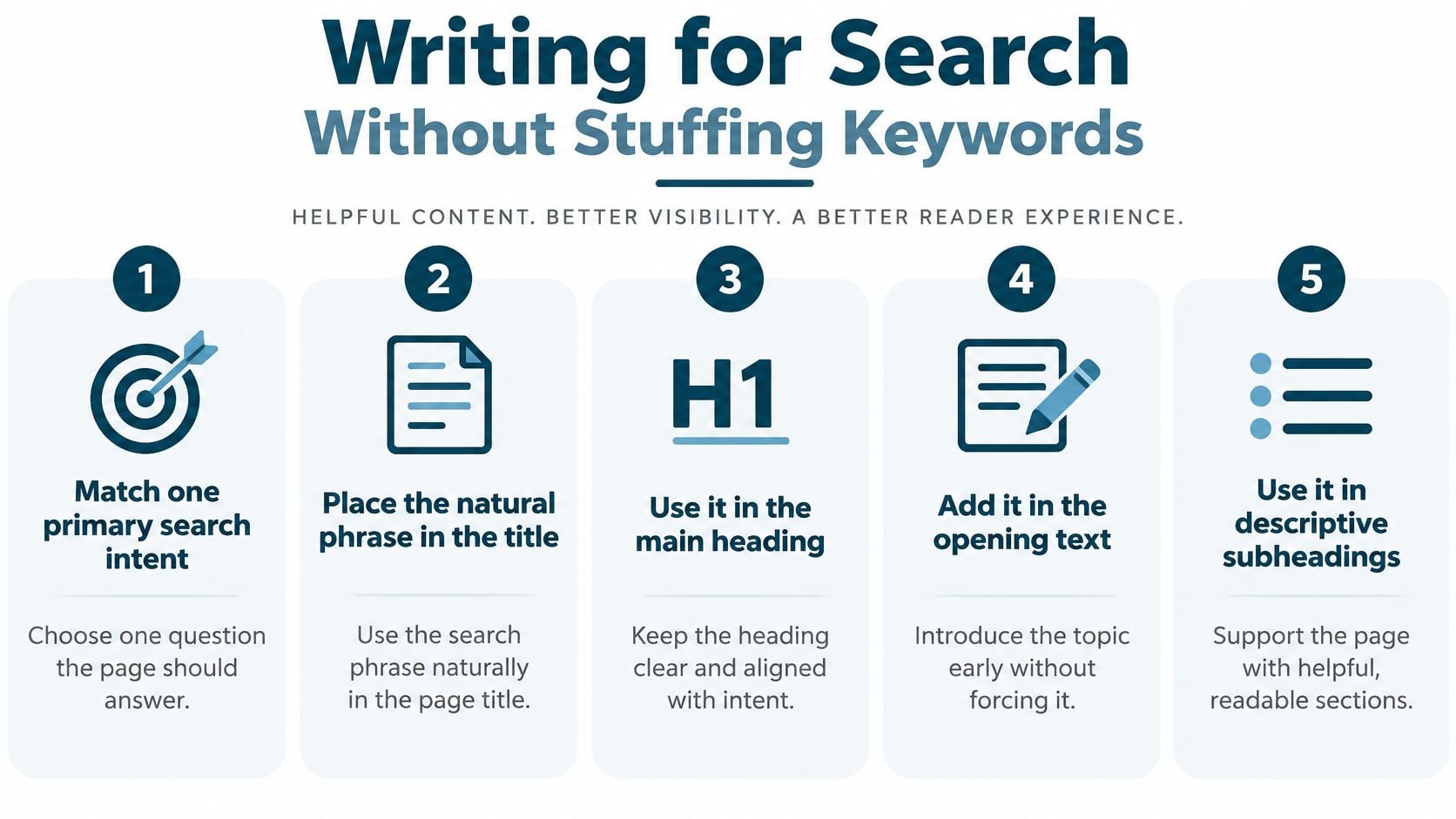
Place the natural phrase your audience uses in the title, main heading, opening text, descriptive link text, and image alt text where it fits. The Google Search Essentials guidance recommends those locations while requiring helpful, reliable, people-first content, and it warns against content produced mainly to manipulate rankings or material that merely summarizes other sources without adding value. Then add the operational details visitors need, what's included, what's excluded, who maintains the site, how success is measured, and what happens after launch. If you want support applying this, our SEO content writing page explains how that work fits into a site.
Keep your titles consistent
Search results may show a title other than the one you wrote, since Google can draw from several places on the page. You can't fully control that, so keep the browser title, visible headline, headings, and internal link text consistent with each other. Mixed naming invites a mixed result.
Score every paragraph for search-intent fit, factual support, distinctiveness, and actionability. Remove any paragraph that fails two or more.
Here's a cut I would make. A paragraph saying the team delivers solutions for every need fails on intent, support, and distinctiveness, so it goes. The replacement names the deliverables, the timeline, and who maintains the site after launch.
Run the Five-Second Test on Your Homepage
You don't need special software for this. You need one person who hasn't stared at your homepage for months and about ten minutes.
The test, step by step
- Open the homepage and let a colleague or customer look at it for five to ten seconds.
- Hide the page. Ask what the business does, who it serves, and what the next action is.
- Write down every wrong or blank answer. Don't explain or defend the page while they talk.
- Revise before adding. If the answers are wrong, fix the headline, opening paragraph, subheadings, and call to action first. Adding more content to a page that fails this test just gives people more to miss.
- Repeat the test with the page that gets the most visits, not just the homepage.
Run it with a few people if you can. One confused answer might be one confused person. The same wrong answer three times is a copy problem.
After the page passes
Record a baseline for task completion, conversion rate, scroll depth, and form abandonment. Then change one thing at a time and watch the trend over several weeks. A small site may not get enough traffic to settle a question in a month, so treat early results as direction rather than proof. Don't rebuild the whole page because of one slow week, and don't declare victory after one good one either.
Sometimes the test shows problems copy can't fix on its own, such as a confusing form or navigation that hides the next page. In that case, have the copy reviewed alongside the site structure and forms, because fixing one without the other leaves the bottleneck in place. A real person from Bruce & Eddy contacts customers to talk about their website, whether it already exists or needs to be built from scratch, so that conversation can start with your test results rather than a sales pitch.
If your homepage fails the five-second test, we can review the copy together with your page structure, forms, and navigation, then fix the pieces that are blocking visitors. Visit Bruce and Eddy to start that conversation with a real person about your existing site or a new one.
