

Run a free scan, fix everything it flags, and call your site accessible. That's the most popular advice on how to improve website accessibility, and it's also why so many sites stay unusable. A scanner gives you a defect queue, not a verdict. It can't tell you whether someone can donate, book, register, or send a contact form without a mouse. Start with the journeys that matter, fix the shared patterns behind them, and let the score follow.
Choosing a WCAG Target Before You Touch Code
Pick WCAG 2.2 Level AA as your working target unless you have a specific reason not to. WCAG is built on four principles: content should be perceivable, operable, understandable, and reliable, and conformance is judged at Levels A, AA, and AAA. Level AA covers the barriers that block the most visitors without requiring every AAA criterion. Version 2.2 is backward compatible with 2.1, so work you do now holds up.
If you need help framing that decision for leadership, Kogifi's approach to accessibility compliance is a useful companion, and our overview of website ADA compliance requirements keeps the legal context in plain language. Don't treat either as a substitute for your own scope.
Write the scope on one page
List five things before any tool runs:
- Templates: home, service, blog, contact, checkout, or donation pages
- Shared components: navigation, search, modals, sliders, and cookie banners
- Logged-in areas: member portals or customer accounts
- Third-party embeds: booking, payment, or donation widgets, plus who controls their markup
- Downloads: PDFs and printable forms
A scan without scope produces a long list nobody can rank.
That one page is the decision that matters. Everything after it is execution.
Ranking Accessibility Problems by User Impact
Treat the audit as a defect queue, not a score. Rank each issue by who gets blocked and how often the pattern repeats. P1 prevents someone from completing a task. P2 makes a task slower or confusing. P3 covers polish. This keeps visual refinements behind failures that interrupt a donation, booking, or form submission.
Good prioritization connects accessibility to the UX design fundamentals and to the UX design practices we apply in builds. Put the fix where it will restore a real user journey, then check whether the same defect lives in a shared component.
| Issue | Who it blocks | Priority | Fix first where |
|---|---|---|---|
| No keyboard access or invisible focus | Keyboard and switch users | P1 | Navigation, menus, modals |
| Form fields without programmatic labels | Screen reader and voice users | P1 | Contact, checkout, donation and signup forms |
| Empty links and buttons | Screen reader users | P1 | Icon buttons, logo links, slider controls |
| Low-contrast body text and labels | Low vision and older users | P1 | Theme colors and design tokens |
| Informational images missing alt text | Blind and low-vision users | P1 | Hero images, product and team photos |
| Prerecorded video without captions | Deaf and hard-of-hearing users | P1 | Pages with embedded video |
| Missing page language | Screen reader users | P2 | Root HTML template |
| Skipped heading levels | Screen reader users | P2 | Page templates |
| Pointer targets under 24 by 24 CSS pixels | Motor-impaired and mobile users | P2 | Icon controls, footer links |
| Decorative images with descriptive alt text | Screen reader users | P3 | Background and ornamental graphics |
Consider a donation amount field with no programmatic label. A screen reader user may be unable to identify or complete it, so it is P1 even if a footer line also has low contrast. An unnamed icon button can make a header menu unusable. Fix shared templates and components before isolated page defects: one header correction can address repeated barriers across the site.
Keep the journey in view while assigning work. For a donation flow, test whether a keyboard user can reach the amount, understand each choice, and submit the form. For a booking flow, check that controls have useful names and focus remains visible. Group repeated instances under one component-level defect, then assign an owner to each priority group before development starts. This prevents teams from spending time on scattered symptoms while the shared cause remains.
How to Audit Your Site Without Trusting a Single Scan
A scan can flag defects, but it cannot tell you whether someone can finish a donation or booking. Audit representative pages and complete user journeys, then treat each finding as a defect to investigate. The W3C website accessibility conformance evaluation methodology calls for representative sampling when evaluating a whole site. WebAIM's 2025 analysis of one million homepages found that 94.8% had detectable WCAG failures, with an average of 51 errors per page, as reported in its 2025 Million report. A homepage-only check cannot establish whether checkout works.
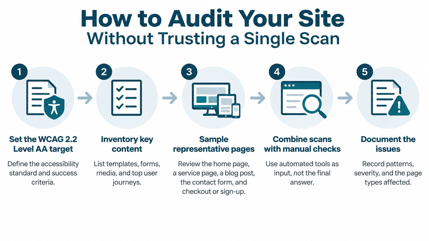
The ten-step audit
- Set the target: Confirm WCAG 2.2 Level AA, then list templates, forms, media, and key user journeys.
- Sample real pages: Include the home page, a service page, a blog post, contact, checkout or donation, and a page with video.
- Scan the rendered page: Run axe or WAVE after scripts load and log findings as defects. Catch design issues earlier by using test your designs for accessibility.
- Use only the keyboard: Tab through each page. Check focus visibility and order, keyboard traps, and whether Escape closes dialogs.
- Listen with a screen reader: Check key flows with NVDA on Windows and VoiceOver on Mac or iPhone. Listen for labels, button names, and error announcements.
- Zoom and reflow: Increase zoom to 200 percent and narrow the viewport to 320 CSS pixels. Look for content that clips or disappears.
- Check structure: Compare heading order and landmarks with the page's visual layout.
- Record each defect: Capture the URL, element, WCAG criterion, affected template, and user impact.
- Fix shared components first: Repair repeated patterns before page-specific defects, then rerun scans after each release. For a broader site review, follow this guide to how to conduct a website audit.
- Validate with real users: Ask people who use assistive technology to complete donation, booking, or contact journeys.
Practical rule: Treat automated output as a queue to investigate, not proof that a task works.
Automated tools cannot reliably judge whether alt text is meaningful, focus behavior is usable, or a workflow makes sense. Manual checks and real user journeys reveal those gaps. Tie each defect to the template and journey it affects, so teams can fix a shared cause once instead of chasing the same symptom page by page.
How to Fix Keyboard, Focus and Semantic HTML Problems
Start with native HTML. A real button, link, nav, main, or list gives you keyboard behavior, roles, and names for free. A div with a click handler needs a role, tabindex, key handling, and a name, all written by hand and all easy to get wrong. Use ARIA only to fill gaps, such as aria-expanded on a menu toggle or aria-live for a status message, then test that the state changes.
Clean semantic markup is the cheapest accessibility work you'll ever do.
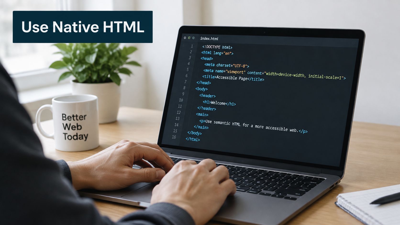
Keyboard basics worth enforcing
Every interactive element should be reachable with Tab, in an order that matches the visual layout. Keep a visible focus indicator. If you remove the default outline, replace it with something stronger, not prettier and invisible. Modals shouldn't trap focus forever, Escape should close overlays, and focus should return to the trigger when a dialog closes. Add a skip link to main content on templates with long headers.
For structure, use one h1 per page, headings in logical order instead of chosen for size, landmarks for header, nav, main, and footer, and a lang attribute on the root element. Say a hamburger menu is built from divs. It'll fail keyboard testing. Rebuilding it as a button in the header template fixes every page at once.
Watch a keyboard and focus walkthrough before you refactor complex menus.
For pointer targets, WCAG 2.2 specifies a minimum of 24 by 24 CSS pixels under Target Size (Minimum), subject to exceptions such as adequate spacing, and defines 44 by 44 CSS pixels at Level AAA. Padding or spacing can sometimes satisfy the minimum for small icons without enlarging the visible icon itself. Test the clickable area, not just the artwork.
How to Fix Forms, Images, Video Captions and Contrast
Fix the failure classes that show up everywhere first. WebAIM's 2025 analysis of one million homepages found low-contrast text on 79.1% of sampled homepages, missing image alternative text on 55.5%, and missing form labels on 48.2%. That same dataset detected 50,960,288 errors, about 51 per homepage. Chasing rare edge cases while labels are missing is poor triage.
Forms, then media, then color
Every field needs a visible label tied to the input in code. Placeholder text disappears once someone starts typing, so it doesn't count. Group related radio buttons and checkboxes with fieldset and legend, mark required fields in text, and write errors that name the field and explain the fix. Turning a border red isn't an error message.
Informational images need alt text that describes purpose, such as "Volunteer schedule for March 2026" instead of "schedule.jpg." Decorative images get an empty alt attribute. A complex chart gets short alt text plus a nearby summary or table. Prerecorded video needs synchronized captions and a transcript when audio carries information. Check auto-generated captions against the speech, since they often mangle names and jargon.
For contrast, check body text, labels, buttons, and small gray text, plus hover, focus, placeholder, and disabled states. When a brand palette fails, fix the design token, not each page.
| Element | Requirement | How to test |
|---|---|---|
| Body text and labels | Contrast ratio of at least 4.5:1 | Check rendered text and background colors with a contrast checker |
| Large headings | Contrast ratio of at least 3:1 | Same checker, using the large-text threshold |
| Informational images | Concise alt text that describes purpose | Read alt text aloud and ask whether the page still makes sense without the image |
| Decorative images | Empty alt attribute | Confirm the screen reader skips the image |
| Form fields | Visible label programmatically linked to the input | Tab through the form with a screen reader and listen for each label |
| Required and error states | Announced state plus a text message naming the fix | Submit the form empty and with invalid entries |
| Prerecorded video | Synchronized captions, plus a transcript when audio carries information | Play with captions on and compare them against the speech |
| Live video or events | Real-time captions from the provider | Confirm captioning is available before the event |
CMS-Specific Fixes for WordPress, Wix and Squarespace
Platform work matters because themes, builders, and plugins generate much of your markup. Fix the generator and you fix every page it touches. Fix pages one by one and you'll be back next quarter.
Platform settings are easier to review when you know which template controls each output.

On WordPress, check what the active theme outputs for headings, focus styles, and skip links. Use the image block's alt text field for each image, and review forms and popups from plugins, since they often sit outside the theme. Put template changes in a child theme or custom CSS so updates don't overwrite them. Bruce and Eddy handles this kind of WordPress template and maintenance work alongside rebuilds, but the checklist is the same whoever does it.
On Wix and Squarespace, check the built-in alt text fields, heading level settings, and language options in the editor. Test embedded booking or form blocks separately, because a third party may control that markup. Confirm current capabilities in each platform's official documentation, since editor controls change.
Be skeptical of overlay widgets that promise instant compliance. They don't repair underlying markup and can interfere with assistive technology.
Template-level help is usually where outside developer time pays off, because one change reaches the whole site.
Set a Retest Schedule Before You Call It Done
Accessibility regresses. A plugin update changes a modal, a new brand color fails on buttons, an editor uploads images without alt text. Put a release gate beside your publishing process and keep it to one page.
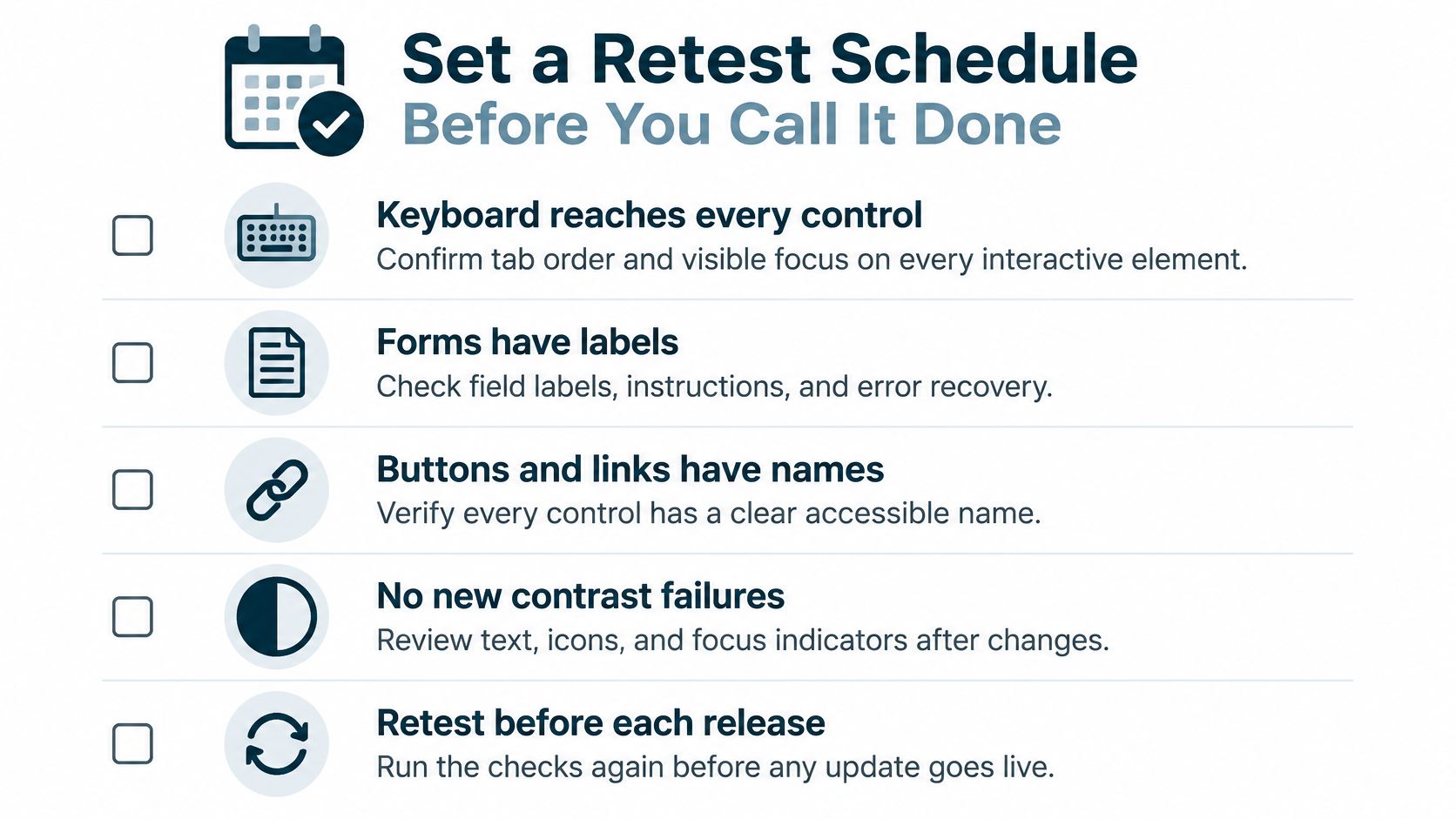
Before release, confirm the keyboard reaches every control with visible focus, forms have labels and working error recovery, buttons and links have names, key colors pass contrast, new images have reviewed alt text, videos are captioned, language is set, headings are in order, and the page stays usable at 200 percent zoom.
Roll out in three waves. Fix P1 template issues first, then P2 sitewide patterns, then add checks to content publishing so new pages arrive compliant. Give each wave a named owner, usually the person who approves releases. Schedule at least one real-user session per cycle. The 2025 Web Almanac accessibility chapter reports a 2025 digital-accessibility survey in which only 36% reported testing with disabled users, while competing priorities were the leading barrier at 53%. Our notes on how to conduct usability testing can help you structure those sessions.
| Trigger | What to retest | Who checks |
|---|---|---|
| New template or theme change | Keyboard path, headings, focus styles, skip link | Developer |
| Plugin or extension update | Forms, menus, modals, cookie banners | Developer |
| New page with images or video | Alt text, captions, heading order | Content editor |
| New brand color or font | Contrast across buttons, links and body text | Designer |
| Scheduled review, suggested quarterly | Key journeys with a screen reader and keyboard | Site owner |
Put the first retest on the calendar today and name who runs it. A date with an owner beats a good intention.
If your audit has turned into a long, unranked list, Bruce & Eddy can help you sort it by user impact, fix the shared templates first, and build retest checks into your maintenance routine. Start with a conversation about your highest-value journeys at Bruce and Eddy, and we'll help you turn accessibility from a one-time scan into a repeatable habit.
